

When making investment decisions, one of the most important factors is cost. If the cost is the leading criteria -- how you value that investment isn’t far behind in priority. Within Decision Lens, users have the ability to see the ratio between the two in a manner that compares value to cost for each of your individual investment options.
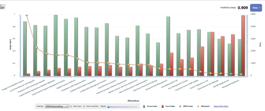
Above you can see green bars that represent value and red bars that represent cost. There is a line graph that runs through the bars indicating the ratio between the two for each project. The names of each project run along the bottom of the bars. There is an orange dot along the ratio line that represents if Decision Lens suggests you should allocate resources to this project and at what amount.
After seeing this visualization in action, you might want to know how does it help you make your decisions? Having the ability to compare between value and cost in one place makes it easier to discuss the tough trade-offs with your team. Quickly defend why you should or shouldn’t invest in a project or program using the Value ROI visualization.
The other benefit is having the ability to see the impact if additional resources are made available. You can see from the graph that there are projects where the cost outweighs their value. What if one or more of those projects “have” to be funded. You are able to visualize what the trade-off would be if you used those resources or had additional resources -- what additional things you could fund.
Would you rather do one very expensive, somewhat valuable project or the 12 low cost high value project? The Value ROI feature is one of the best ways to succeed in portfolio planning and optimization.
Let's get started
We have been modernizing public sector planning for 15+ years, evolving our solution to meet the needs of today while delivering the cutting-edge capabilities of tomorrow.
